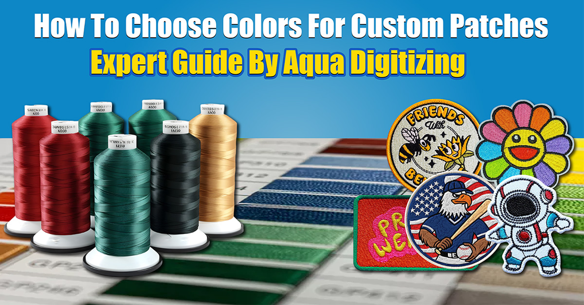
How to Choose Colors for Custom Patches (Expert Guide by Aqua Digitizing)
Custom patches need the right colors to stand out, look professional, and convey the right message. Color selection is important whether you’re creating patches for a business, sports team, fashion brand, club, or event.
Using professional design principles, color psychology, and embroidery best practices, Aqua Digitizing shows you how to choose colors for custom patches.
Custom patches: Why color selection is important
When people see a patch, they notice the color first. Choosing the right colors can make your patch look great and be memorable, while choosing the wrong colors can make it look dull and hard to read.
Color selection helps:
Visibility of patches
• Recognizing your brand
• Clarity of design
Looks professional
• Appeals to customers
Aqua Digitizing, a professional digitizing company, always plans color combinations before production.
1. Understand Color Psychology Before Choosing Patch Colors
There’s a different message for every color. A professional designer always takes color psychology into account before finalizing a patch design because colors affect how people feel about your brand.
Red, for example, represents energy, passion, and urgency. This is why sports teams and fire departments use it for patches to show strength and action.
Blue symbolizes trust, professionalism, and stability. Corporate organizations and security companies like blue patches because they’re reliable.
Green represents nature, growth, and harmony. It’s perfect for outdoor brands, environmental organizations, and eco-friendly businesses.
Black is a symbol of power, authority, and luxury. Because it gives a bold look, it’s commonly used in tactical patches, premium brands, and motorcycle clubs.
Yellow represents optimism and attention. It’s often used for safety patches and promotional stuff because it’s so visible.
Orange shows creativity and enthusiasm. The vibrant look makes it popular with youth brands and creative organizations.
Colors should match your brand personality and the message you want your patch to convey.
2. Make sure it’s visible and contrasted
Contrast is key to patch design. If your text or logo doesn’t have enough contrast, it’ll be hard to read.
Improve visibility:
• Lighten up dark backgrounds with light colors
• Dark colors on light backgrounds
• Don’t mix similar shades
• Put borders around your text and logos
Black text on a white background is easy to read, but dark blue text on a black background can be hard.
You’ll still be able to see your patch design even from a distance with strong contrast.
3. Pick colors and themes that match your brand
Keep brand colors consistent when making patches for businesses or organizations. You’ll be able to recognize your brand more easily this way.
For example:
It’s a good idea to use official brand colors on corporate patches
• Team colors should be on sports patches
• Event patches should match the event’s branding
• Club patches should reflect group identity
If you hire a professional embroidery digitizing service like Aqua Digitizing, your thread colors will match your logo colors pretty closely.
4. Combine colors better with the color wheel
Color wheels are often used by designers to create attractive color schemes.
You can use complementary colors, which are opposite colors on the color wheel, like blue and orange or red and green. Strong contrast is created by these combinations.
Blue and green are analogous colors, which are colors next to each other. Combining these colors creates a smooth, professional look.
For vibrant designs, use triadic color schemes, which combine three balanced colors.
You can experiment with color combinations with tools like Adobe Color:
https://color.adobe.com
5. Mockups are great for testing colors
Make digital mockups of your patch before you finalize it. It’s easier to see colors on a screen than on embroidery thread.
You can check these things with mockups:
• How embroidery colors look
• Visibility in different lighting
• Look at small sizes
• Thread shine effects
• Balance between design elements
The right testing prevents costly mistakes.
6. Make sure you follow accessibility guidelines
A good patch design should be readable by everyone. It’s not just good design, it’s good usability.
In order to make it more accessible:
• Use contrasting colors
• Avoid using color alone to convey meaning
• Add outlines for clarity
• Don’t mix neons too bright
Use this tool to check contrast:
7. Don’t use too many colors
You can make your patch look messy if you use too many colors.
Recommendations:
• Two to four color patches
• Standard patches in four to seven colors
• Detailed patches → Maximum 9 colors
Using fewer colors can make your design look cleaner and more professional.
8. Take fabric and thread effects into account
Digital designs don’t reflect light like embroidery thread. Colors may look a little different after production.
Factors to consider:
• Fabric background color
• Thread shine
• Density of stitching
• Texture of material
It’s important to work with an experienced digitizer like Aqua Digitizing so colors translate correctly.
9. Hire a professional digitizer
Embroidery digitizing can make even the best color scheme fail. Your patch will look perfect thanks to professional digitizers.
Their services include:
• Thread color match
• Planning your stitch direction
• Optimize color sequences
• Contrast adjustments
• Production quality control
Avoid design and production mistakes by working with experts.
Color Mistakes to Avoid
Color selection is one of the most common mistakes people make.
Mistakes include:
• Too many colors
• Poor contrast choices
• Ignoring the color of the brand
• Skipping mockup testing
• Picking trendy colors instead of timeless ones
You’ll save time and money if you avoid these mistakes.
Checklist for choosing patch colors
Ask yourself these questions before you pick your patch colors:
• Are the colors right for your brand?
• Does the contrast look good?
• Can you read the design from a distance?
• Did you make a mockup?
• Can you embroider these colors?
• Does the patch look professional?
Your design is ready if you answered yes to all.
Final Thoughts
Choosing the right colors for custom patches requires understanding color psychology, maintaining strong contrast, following brand guidelines, and testing designs before production.
By following these expert tips from Aqua Digitizing, you can create custom patches that look professional, attractive, and long-lasting.
If you want perfect color matching and high-quality embroidery digitizing, working with experienced professionals can help you achieve the best results.
Frequently Asked Questions
What colors are best for custom patches?
High contrast color combinations like black and white, navy and gold, and red and white usually work best.
How many colors should a patch have?
Most professional patches use between 3 and 7 colors for the best balance of detail and cost.
Do more colors increase patch cost?
Yes. More colors require more thread changes which can increase production time and cost.
Can gradients be used in embroidery patches?
Embroidery usually uses solid colors, but gradients can be simulated using special stitch techniques.